Principles of Visual Balance
Principles of Visual Balance
When the eye finds harmony before the mind understands the design
Principles of Visual Balance
Principles of Visual Balance
When the eye finds harmony before the mind understands the design
Introduction
Why does every design start with balance
Visual balance isn’t just a rule of design. Balance is the first sensation the eye experiences. This occurs before grasping the idea. It happens before reading the words and before understanding the message
Balance is what makes a design comfortable, harmonious, understandable, and eye-catching without being jarring
It’s the moment the eye says, “Here… everything is in its right place
Balance
isn’t symmetry. It’s harmony
Some believe balance means everything is even on both sides. But the truth is deeper than that. Balance is the distribution of visual weight. It is a relationship between elements. It gives a sense of stability
It’s not simply repetition. It’s not just symmetry. A design can be balanced even if it’s asymmetrical, as long as the eye feels comfortable moving between its elements
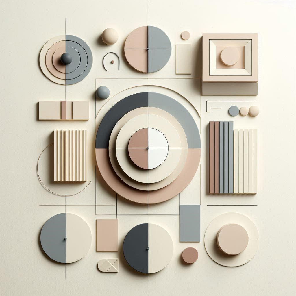
Types of Visual Balance
a) Symmetrical Balance
: This is the classic balance
Elements are evenly distributed on both sides of the axis
It gives a sense of stability, formality, and tranquility
b) Asymmetrical Balance
This is more modern and bolder
It doesn’t rely on symmetry. Instead, it relies on the weight of the elements. These include size, color, shape, distance, and movement. This type creates a dynamic, attractive, and high-energy design
c) Radial Balance
Elements emanate from a single center
It is used in logos, ornaments, and designs that require strong visual focus
How Does the Eye Feel Balance
The eye moves within a design like a visitor wandering through an art gallery
If the distribution is disharmony, the eye feels distracted
If the balance is correct, it feels comfortable and settled
Factors that affect an element’s weight
Size: Larger is heavier than smaller
Color: Darker is heavier than lighter
Luminousness: Glossy is heavier than dull
Texture: Rough is heavier than smooth
Distance: Near is heavier than far
Shape: Complex shapes are heavier than simple ones
Balance is the art of distributing these weights
Space… The Silent Champion of Balance
Space is not empty space, but a fundamental element of balance
It allows elements to breathe and prevents a design from appearing cluttered or suffocating
Space is the silence that makes music audible
Balance as a Tool for Message Conveying
Balance is not just aesthetic
It is a language
Balanced Design = Clear Message
Unbalanced Design = Confused Message
: Balance helps to
Guide the eye
Prioritize tasks
Highlight important elements
Create a seamless visual experience
Balance is what makes a design “read” before it is understood
Balance… The Soul of Design
Visual balance is not merely a technical rule, but an inner sense that develops over time
It is the ability to see the relationships between things
and the ability to create harmony between elements, however different they may be
Conclusion
Balance is what makes design art… and art is a message seen before it is spoken